Bar charts on Chris Matthews show
I'm not a grammar nazi, nor a stats nazi, but I'm going to rant anyhow...
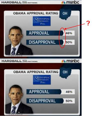 The Chris Matthews show (on MS-NBC) routinely shows statistics in a form that looks like a horizontal bar-chart. The only problem is that the "bars" are always the same length, regardless of the stats. I've noticed this for many months.
Don't those look like horizontal bars? The rounding does it for me.
The example below is how it should be fixed.
Is this illiteracy from MS-NBC, or do they have some strange intent?

Here's another example. Why are all the reds, whites and blues the same size?
I don't think these are meant to be horizontal bars or that MS-NBC ever thought of that.
ReplyDeleteThey are supposed to IMITATE a bar chart. I may not respect the producers at MSNBC, but I would never underestimate them. If you want to ask WHY they would use such a visual, you may draw some unpleasantly cynical conclusions about those producers and their estimate of the audience's intelligence.
ReplyDelete