U.S. Participation Rate
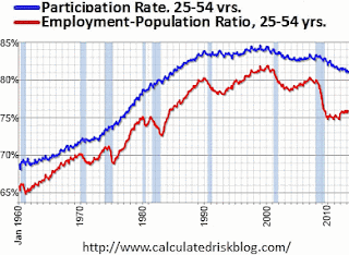
 If you follow economic news, you know that the "participation rate" (the % of people who say they are actually looking for a job) has been falling in the U.S. [See the blue line in the chart.] [Source: the great Calculated Risk blog.]
The overall participation rate was expected to drop as the "baby boom" generation retires. That's not the cause though. As this chart shows, the participation rate within the 25-54 year group began to fall after the dot.com bust, flattened out, and then began to fall again after the housing bust.
This age group does not go back to college in huge numbers. Some of them were probably part of the huge increase in "disability" rolls. Others probably stay home with a spouse to support them, having decided to wait things out until the economy improves.
Changes, by Age and Sex: How has the housing bust impacted participation rates across age and sex? For example, people around 65 years old have a lower participation rate than those around 45. However, which one changed most? If the participation rate in 1990 was the baseline, what was the change to 2000, and then to 2010? This might point to behavioral changes. Here's my chart of the numbers. Scan down the right-hand side to get a feel of the distribution. (Source: BLS Table 3.3)
Late to work / Late to retire: The most striking thing about the chart is that the participation rate is increasing among older folk and falling among the young. This is not necessarily a bad thing. Indeed, as more kids opt for college and as older people are in better health, these two are trends to be expected. However, look at the line for Men 16-19: it was already dropping into 2000, but it has plummeted after that: clearly, the housing bust has made a difference. Or, take Women or Men 62-64 and notice that more of them were already staying in the workforce, but the housing bust has made this shoot up much more. The impact shows up more in the 20-24 group: men's participation was already falling, but plummeted; women's participation was rising slightly, but turned down.
Men 35-54: Also note the lines for Men 35-44 and 45-54. The housing bust did not impact the trend since 2000, but why has the trend has been negative since 2000? I wish there were more statistics on the reasons behind the fall in their participation.
Focus on the post-2000 change: What if the 1990-2000 trend had stayed steady for each age/sex group? How does the 2010 data differ from such a steady-change assumption. I end up with a new chart.
Once again, the most stark change is by age. There was a trend for older people to work more, but the housing bust has clearly forced more of them to postpone retirement. The youngest have clearly put off getting jobs much more than we could have predicted from the trend.
Of these, the more troubling are younger people who are staying at home, or using some very general and basic college to pass time.
Structural changes: The most negative structural change is probably not at the extremes. The fall-off in participation rates among both men and women aged 35-54 is probably here to stay. It is around 2%, but it does add the the drag on wealth-creation and points to a "new normal" of lowered GDP.
Geeky footnote on the calculations: The charts are drawn by subtracting one rate from another (say the rate in 2000 from the one in 1990). It would have been more accurate to express the change in the rate as a percentage of the original rate. However, doing so does not change the conclusions, so it was not worth it. Also, the dates are chosen because they are census years, the actual inflection point were different.
Once again, the most


Comments
Post a Comment