Posts

Showing posts from March, 2013

Food Prices - 30 Years

Image
Curious about food prices, I checked out the 30-year history of prices for Wheat, Rice and a few other such commodities. (From the indexMundi  web-site). This post shares my findings -- with zero commentary. The top-most chart below is the official CPI-U (from the Federal reserve web-site). Data is shown for 30 years, since 1983. This line is then reproduced as an overlay on each of the other price charts. Consider the chart for Wheat (top-left). For 20 years the trend was flat, even though the price went up and down.  The last decade has seen a climb. After staying flat, the price of Wheat has made up for lost time.  With the exception of Pork, this theme is repeated across the other food commodities. (Sugar is the worst.) I do not expect extreme levels of CPI-U in the next 5 years -- but, I promised zero commentary.

How're we doing on Unemployment? (March 2013)

Image
Since my last look in November 2012 , the various measures of employment have remained along their recent  trajectories. A snapshot: Unemployment rate slightly better each quarter (largely because so many people have stopped looking for jobs)  [About 200K jobs were created, but this was plus 400K part-time jobs and minus 200K full-time jobs] Participation rate (how many want jobs) between flat and slightly worse. Employed-to-population ratio , between flat and slightly better The source of all the graphs below is the excellent gallery at "Calculated Risk ". The unemployment rate has been dropping slowly but steadily for over two years. This "headline number" that is reported the most widely. It is also the one that gives the most positive picture. A "naive linear" projection gets us back to a pre-recession rate by the second half of 2014.  As the graphs below show, the "quality" of this rate will be much lower than what ...

Bar charts on Chris Matthews show

Image
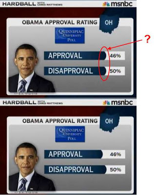
I'm not a grammar nazi, nor a stats nazi, but I'm going to rant anyhow... The Chris Matthews show (on MS-NBC) routinely shows statistics in a form that looks like a horizontal bar-chart. The only problem is that the "bars" are always the same length, regardless of the stats. I've noticed this for many months. Don't those look like horizontal bars? The rounding does it for me. The example below is how it should be fixed. Is this illiteracy from MS-NBC, or do they have some strange intent? Here's another example. Why are all the reds, whites and blues the same size?