How're we doing (Oct 2011 Edition)?
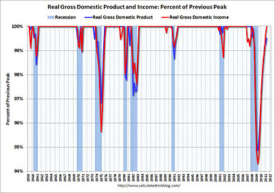
The economy is still in a funk, way below its most 2008 peak. Look at Personal Income, with the effect of prices taken out (i.e. "real" personal income). The great Calculated Risk blog has a chart showing these values relative to the most recent "peak". This gives us a normalized view of how much Incomes are dipping.
By this measure, we see a 5% dip, unprecedented since the Great Depression (pre-1960 not shown). However, we have fully rebounded now -- at least by this one measure.
One problem with this measure is that it includes "transfer payments". Since a government can borrow to pay welfare, let's subtract these payments and see what that looks like.
(Click here for original chart)
This second chart excludes transfer payments, and shows:
- a larger (10%) dip
- we have not fully rebounded
By this measure, we are half-way back to the peak. If we extrapolate the line upward, we'll probably be back to peak in 3 years or so.
(Click here for original chart)
Importantly, we should not simply extrapolate that line upward. Some good economists are predicting a "double-dip" just around the corner. So, the line could turn back down, or it could slow, or it could flatten.
Nevertheless, the good news is that we were down 10%, and though we might head back there again, a 10% shrinkage is far from the collapse of civilization.


Comments
Post a Comment