Posts

Showing posts with the label ECONOMIC STATISTICS

How're we doing? (A review of 2014)
Image
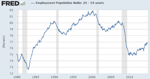
Overview:  Like last year, 2014 gave us a s lowly improving economy, and a rocketing stock market ! Since the 2007-08 downturn, most measures of the economy have stabilized and have started to improve from their bottom. Even total-employment got back, though the more important number (Employment-to-population) is still low.  The broadest GDP measure has been increasing very slowly. House-prices came well off their bottom, someway half-way to the old peak, but have recently flattened for a few months. Meanwhile, the stock market is at an all-time high. Corporate profits are high since GDP is growing slowly while firms have kept a reign on costs. Companies have kept buying back stock at above-average levels. This is different from the type of excitement that drove the dot.com boom, because it does not cascade into higher salaries and expenditures: quite the opposite. In the short/medium term, this is "blah" for employment numbers and wages. Here are some of the detail...

Personal savings flat once more

Image
A downturn in the economy or the stock-market usually causes people to pause spending to see where the chips will fall. Even people/businesses who think their jobs/revenues are relatively secure become cautious. This caution, in turn, implies less sales for some businesses, creating a downward spiral. Only to a point, though: as it spirals down, business profits start to increase and personal savings increase too. Confidence starts to come back. Savings rate: The red circles in this chart show temporary increases in the Personal Savings Rate during recessions. Unfortunately, after each recession the personal savings rate started to decline once more. We see that the savings rate has flattened once again. This is the flip-side (and downside) of confidence. [Update (2017/June: This rate still remains mostly above the 5% mark] Retirement confidence: Compared to previous years, workers who are still employed are less confident that they will have enough money to live ...

How're we doing? (A review of 2013)

Image
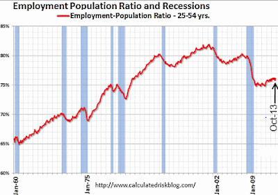
Overview:   Slow economy, rocketing stock market ! Since the 2007-08 downturn, most measures of the economy have stabilized. Despite this, total-employment is still lower. The broadest GDP measure has been increasing very slowly. Meanwhile, house-prices have turned up for the last two years, and the stock market is at an all-time high. Corporate profits are high since GDP is growing slowly while firms have kept a reign on costs. In addition, companies have been buying back stock at above-average levels . This is different from the type of excitement that drove the dot.com boom, because it does not cascade into higher salaries and expenditures: quite the opposite. In the short/medium term, this does not bode well for employment numbers and wages. Here are some of the details: Employment: Though the unemployment rate has been falling, it is mainly because so many people (particularly younger folk) have given up looking for jobs . For the core age-range 25-54 years, employ...

U.S. Participation Rate

Image
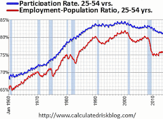
If you follow economic news, you know that the "participation rate" (the % of people who say they are actually looking for a job) has been falling in the U.S. [See the blue line in the chart.] [Source: the great Calculated Risk blog .] The overall participation rate was expected to drop as the "baby boom" generation retires. That's not the cause though. As this chart shows, the participation rate within the 25-54 year group began to fall after the dot.com bust, flattened out, and then began to fall again after the housing bust. This age group does not go back to college in huge numbers. Some of them were probably part of the huge increase in "disability" rolls . Others probably stay home with a spouse to support them, having decided to wait things out until the economy improves. Changes, by Age and Sex: How has the housing bust impacted participation rates across age and sex? For example, people around 65 years old have a lower participation r...

How're we doing on Home Prices (July 2013)?

Image
The first two measures compare prices to rents and to median income. Doing so, factors out the "nominal" aspect of price-change. Price-to-Rent ratio:   Over a year ago  this measure was almost down to the 1990 average. Since then, it has almost flattened out, falling only slightly. Source: As always the best source for such charts is the Calculated Risk blog . Price-to-Income ratio: A very similar pattern here. (Caveat: Chart only up to 2011) By both these measures, we can see that prices are slightly above their historical average, but only slightly (and way below their boom-time prices). They also seem to be flattening out. Seems a decent enough time to buy a home. Debt Obligation Ratio:  Instead of price, this measure looks at the monthly payments. Since interest rates are low (they've risen in the last month though), by this measure people are spending a historically low percentage of their incomes on mortgages. Other consumer debt is not hig...

Food Prices - 30 Years

Image
Curious about food prices, I checked out the 30-year history of prices for Wheat, Rice and a few other such commodities. (From the indexMundi  web-site). This post shares my findings -- with zero commentary. The top-most chart below is the official CPI-U (from the Federal reserve web-site). Data is shown for 30 years, since 1983. This line is then reproduced as an overlay on each of the other price charts. Consider the chart for Wheat (top-left). For 20 years the trend was flat, even though the price went up and down.  The last decade has seen a climb. After staying flat, the price of Wheat has made up for lost time.  With the exception of Pork, this theme is repeated across the other food commodities. (Sugar is the worst.) I do not expect extreme levels of CPI-U in the next 5 years -- but, I promised zero commentary.

How're we doing on Unemployment? (March 2013)

Image
Since my last look in November 2012 , the various measures of employment have remained along their recent  trajectories. A snapshot: Unemployment rate slightly better each quarter (largely because so many people have stopped looking for jobs)  [About 200K jobs were created, but this was plus 400K part-time jobs and minus 200K full-time jobs] Participation rate (how many want jobs) between flat and slightly worse. Employed-to-population ratio , between flat and slightly better The source of all the graphs below is the excellent gallery at "Calculated Risk ". The unemployment rate has been dropping slowly but steadily for over two years. This "headline number" that is reported the most widely. It is also the one that gives the most positive picture. A "naive linear" projection gets us back to a pre-recession rate by the second half of 2014.  As the graphs below show, the "quality" of this rate will be much lower than what ...

U.S. Economy: Federal Debt- How big is it?

Image
( Updated: Dec 2012 ) Lots of numbers:  Trying to get a clear picture of U.S. government debt can be frustrating. The government owes: 60% of GDP : bonds owed to private entities , both foreign and domestic 100% of GDP : if we add bonds owed to the government-itself (e.g. Social Security "trust fund", Federal Reserve) 400%+ : if all Fed promises to social security and medicare recipients are met (they won't be) [Note: the GAO claims that adding another 2% (of payroll) to the current 13% payroll tax would keep social security funded for more than 70 years!] A snapshot: The U.S. government (officially) owes about US $16 trillion to the public, plus to the Fed, plus to the "trust funds".  The GDP of the U.S. is approximately $16 trillion. (Both these were about $15 Tr. last year.) To put this in perspective:  adding up the assets of everyone in the U.S. and subtracting liabilities, we get a "net worth" that adds up to about $ 64 trillion ($5...

How are we doing on Unemployment (Nov 2012 edition)

Image
Last time I looked at unemployment , in Feb 2012, the number of people  employed was flat; but, with people dropping out of the workforce, the unemployment rate had started to fall. The rate has continued to drop (upward in the graph from Calculated Risk , shown below). To the right, I've added a "naive linear projection" which would see pre-recession unemployment rates return by 2015. Instead of the commonly-reported rate, we could simply look at the number of people employed as a percentage of the population . This chart shows the core working-age range (25yrs -54yrs). Notice the slight uptick near the end of the chart. After a flat 2010 and 2011, we've seen a slight rise during 2012. What if we do a naive extrapolation of this chart? When will we reach the pre-recession 80% for this age-range? We get the orange arrow drawn at the end... ... not getting back to pre-recession levels for at least 5 years (that's 2017). Unfortunately, if we look at da...

Any month's Unemployment Report is useless

Image
The monthly U.S. unemployment report is not much use as a real-time statistic. The data is meaningful only after it has been revisited, revised and is no longer current. Two factors make it difficult to compare the report with the "normal": seasonality  and the birth of new businesses. Adjustments are required. Total Non-Farm Employment (No Seasonal Adjustment) Seasonality: Statisticians adjust monthly data for seasonality in order to make better comparisons. For example, every year total employment drops sharply from June to July ( see chart ). If it drops this year, it is not necessarily bad news -- it could be an expected seasonal pattern. Instead of reporting the actual ebb and flow, statisticians often report a seasonally-adjusted number. A drop that is much less than normal , may be reported as an increase in employment! Birth-death Adjustments: A second adjustment by the BLS is an attempt to estimate how many new businesses have been ...

How're we doing? (Sept 2012 edition)

Image
Unemployment: Yesterday's jobs report (Sep 7th) was reported as negative, after last month's positive. The monthly fluctuations have become standard since 2010 (see graph). Basically, the growth in jobs has been flat -- around 125K jobs per month since 2010 . It takes about 150K jobs just to keep up with population growth, but people have been dropping out of the job-market. Consequently, the official unemployment rate has dropped slightly, and ever more slowly. GDP: Huge amounts of "fiscal stimulus" have brought GDP back over its pre-recession level. The piper will have to be paid some day... but not yet. However, if one subtracts "transfer payments" from GDP, or if we look at industrial production, or the total number of people employed, we are still about 97% of the pre-recession levels. ( See this August 5th post from the excellent Calculated Risk blog for details .) Retail Sales:  Though retail sales rebounded from its recessionary lows, ...

Country Shares of World GDP

Image
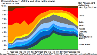
Here's a chart of world GDP, broken down by country share. ( HT: Carpe Diem ). Careful with the x-axis, it is not at all to scale! The basic idea is that India and China had large shares pre-industrial revolution, after which Europe rose. The U.S. shoots up, to over 40% of world GDP by 1950. Then, Japan begins to grow in the 1960s, and China in the 1980s. Suppose countries end up with GDPs proportionate to their populations. What would that picture look like? I've added a bar to the right, showing the break-down of world-population. Look at the U.S. squished down, with less that 400 million out of a world population of over 7,000 million. The biggest change is in the previously un-noticed 'rest of the world". If Africa, the Middle East and so on moved toward freedom, that could be the story of the century.  What if they do not? Here's a chart with a new assumption. Suppose the "rest-of-world" does not increase its relative s...

The options for Greece and the Euro

Image
Among Euro countries, Greece is seen as least creditworthy. It cannot "print" Euros -- that's the ECB's job. So, it cannot adopt a traditional Keynesian route to stimulus. Greece's  nominal GDP will soon have shrunk 20% ! They recently defaulted on debt, but must default once more on the 500 billion Euros still owed (of which  250 b is owed to European governmental  organizations .) They have started a little "austerity", but doing too little is a mistake: it drags out the recession, without fixing anything; and, in the end, everyone blames "austerity". The Greeks want the EU to help them out some more, while the EU (mainly the Germans) want the Greeks to do more to fix their economy. The major options facing Greece and the EU today are: Greece leaves : goes back to the Drachma, but everyone else stays in the Euro Euro unravels:  perhaps a few countries (Germany, Netherlands, etc.) keep the Euro, while most others leave Euro survives ...

How are we doing on CPI price-levels (May 2012 edition)

Image
This post is about the Consumer Price Index (CPI). Many criticize the CPI for understating price-increases prices, but this post is not meant to critique it. I want to address two questions: How has the CPI been doing? What are the market-expectations for CPI, over the next few years? Short term history:  Over the last 9-years, this is what we see... ... CPI risen about 3% a year in the early part of this period. ... the housing-bust caused CPI to drift lower ... now, it seems headed back to 3% a year Long-term history:  See the chart below. Looking back 50 years, the first thing that pops out is that the range of rates (even rates averaged across 5-year periods) is very large .CPI rose 2%-3% in the 1950's and for most of the 1960's. Then, starting in the late 1960's, it rose  inexorably to 12% It began to drop again in the mid-1980's and early 1990s. Since then, CPI rises have averaged around 3% per year. So, what happens in the future? ...

How're we doing on Home prices (April 2012 edition)

Image
Businessman Warren Buffet recently suggested that U.S. "single family homes" were a good buy. Prices have fallen and mortgage interest rates are low.  Here's the Case-Schiller index of home-prices. (For original versions of the graphs shown below, see the excellent Calculated Risk graph gallery .) Nominal prices: This graph shows the 10-city average and the 20-city average. The index dropped from its peak and has remained steady over the last 3 years. However, if we look to the left portion of the graph, we'd ask: could prices fall further, closer to the flat level of the 1990's? Real Prices:  To get a better historical comparison, we should look at a "real" version. One way is to use the CPI to normalize the index. This gives us the next graph. Since the CPI is significantly up since the 1990's we see that prices are very close to 1990 levels. A 10% drop would take us back to those levels. [Note: Increasing house sizes are already...

Greece Defaults

Here is a time-line ( from John Maudlin ): 2009 Dec: European Central Bank (ECB) president says there is "no possibility" of a Greek default 2010 Jan: European monetary commissioner says there is "no Plan B" for Greece because it will not default 2010 Sep: Greek Finance minister says there will be no restructuring of debt 2012 Mar: Greek defaults on its debt, changing some laws with retroactive effect Consider that it took over two years from when a default seemed a so likely that it was being denied officially, to the time it actually occurred. Sometimes these things can take a while to unravel. Mostly, this was wasted time... but, that's how things play out on the political stage. Defaulting on one's debt is not a good thing. However, there's a good reason for bankruptcy law: if a debtor simply cannot pay his bills, there comes a point where the best solution is to recognize reality. Similarly, it sometimes makes sense for a creditor to...

How're we doing on Unemployment? (Feb 2012 Edition)

Image
In October I posted some GDP graphs from the excellent Calculated Risk blog. In summary,  "Real Personal Income"  was still 5% below the pre-recession peak when ignoring "transfer payments".  Additionaly, in four years of recession, the population has grown, and the numbers look worse on a per-capita basis. In this post, I switch my focus to unemployment. Unemployment rate has bottomed:   Here is a graph ( sharper original on Calculated Risk ), comparing the rise of unemployment (downward in the graph) in past recessions, and how soon the rate recovered to its pre-recession level. Post WW-II,  the unemployment rate has never turned so weak nor has it remained weak for so long. Based on historical patterns, it is optimistic to think unemployment will return to its recent pre-recession low (about 5%) any time in the next 2 years. Participation rate falling: One problem with the unemployment rate is that it under-counts dejected workers who have gi...